I’m trying to use the data of xkcd’s color survey to produce a kind of political map of color the HSV color world. This is getting way more complicated than I thought initially ;)
Here is the initial plain world map of HVS color space (mapped 2D i.e. not including greyscale):
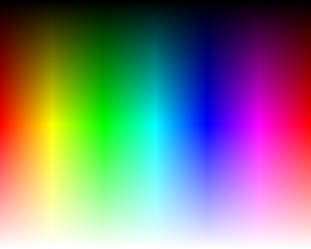
2d view of hsv colorspace
Well, with this mapping comes a problem, best illustrated by this graph of the survey’s data density mapped into HSV space (the survey data is distributed just fine, but when mapping RGB to this crippled HSV, things get weird). White is much data, black is none:
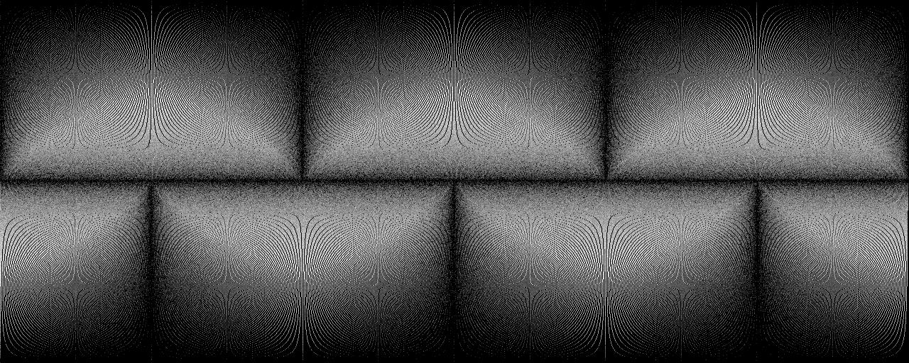
density when converting from RGB to HSV
So here is a couple of things that suck as well when playing around: noisy data, spelling (xkcd has a list), RGB, gimp, HSV, python (occasionally) and most of all: colors (that’s not true, colors rock!). Things that rock too: python, PIL (sometimes), PNG, mogrify.
Anyways, I’m not yet completely there, but some of my intermediate results are already pretty cool, so have a look.
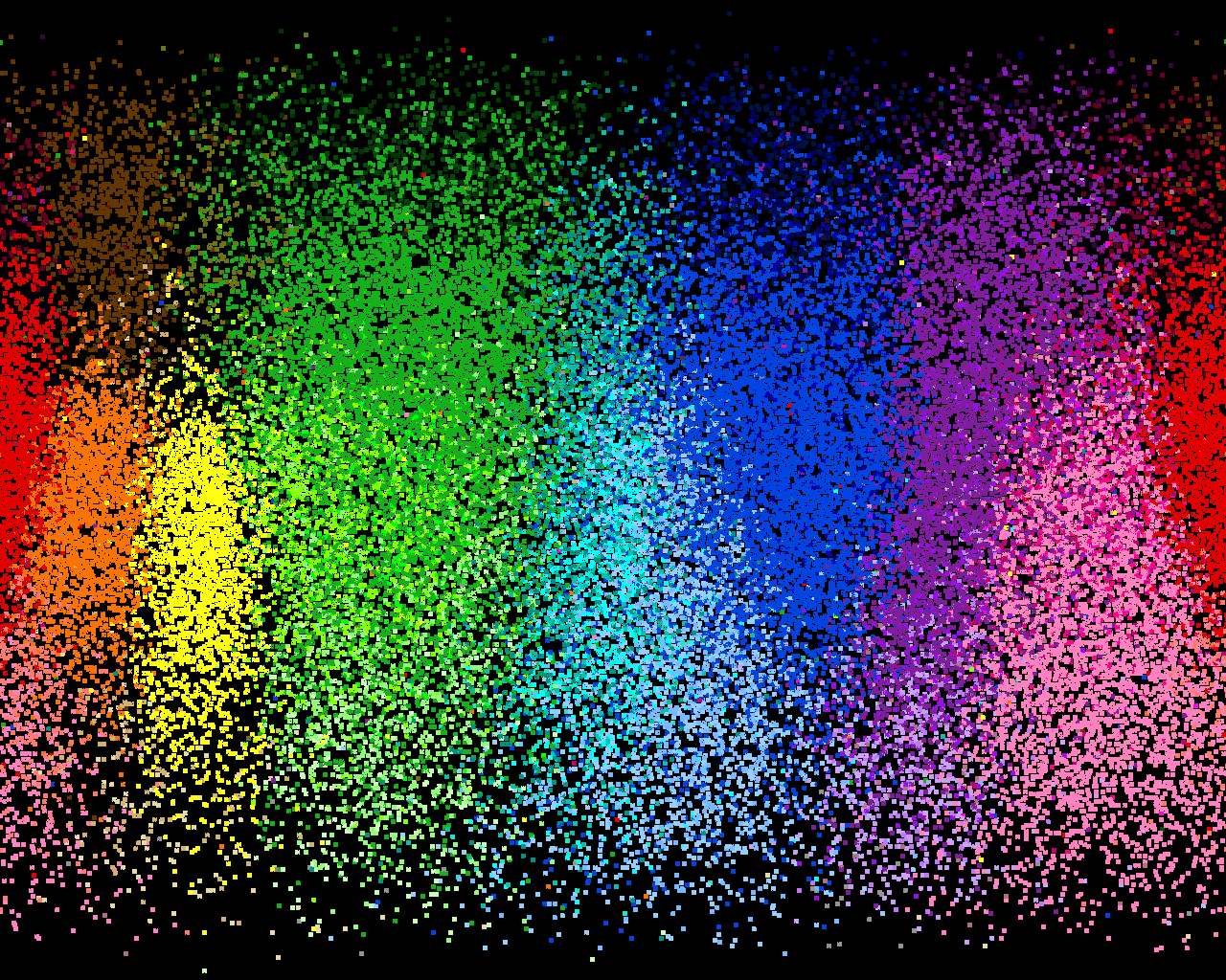
initial color speckles
I actually forgot how I produced this map, but I guess it shows top-40 colors people describe at each point of the HVS space mapped to color most fitted by the word they used. Dots are slightly bigger because I added a 3x3 gaussian filter to input data.
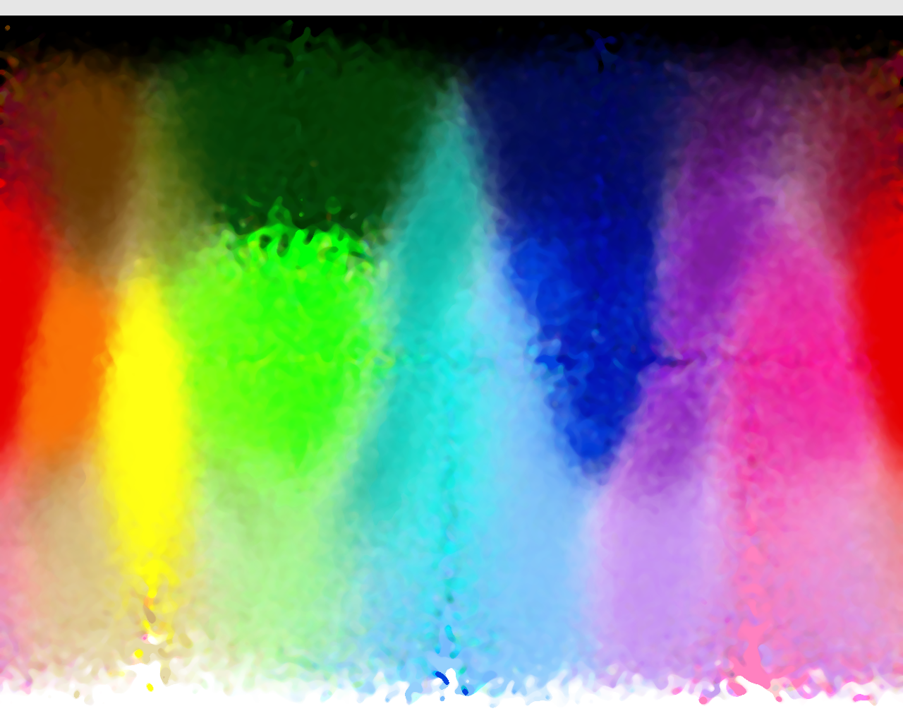
A lot of more coding and quite some magic allowed to get the borders for continents, so I hereby present you the first HSV color continents map:
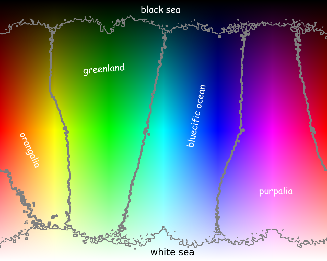
hsv continents world map
So now, you might be thinking: if he’s producing a continent map, why can’t he do the countries the same way? Well, countries are much more complicated, as they tend not to be so well seperated as continents. Also many people just answer “green” for all kinds of green-tones, so in the “light green” area, there is a lot of “green” noise, but I figured that out already.
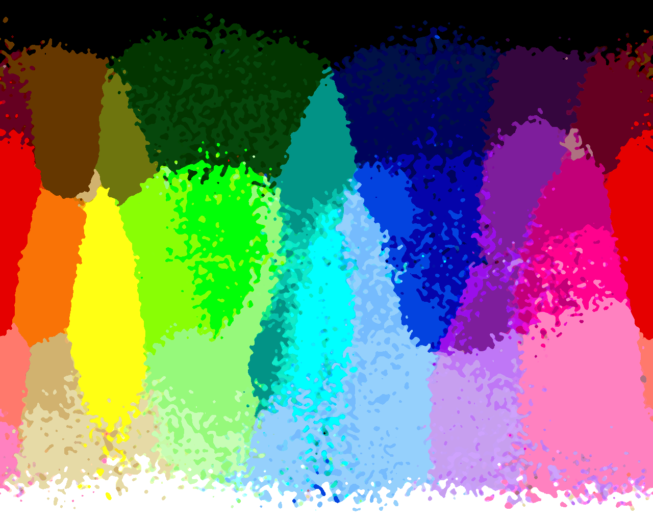
plain simple country map
However, if you look at this map, there are some areas for which it is quite clear, which country they should be (e.g. yellow is very well seperated from the others), but several blue, green or purple tones are still troublesome. My current approach is to find these troublesome areas, so that I can declare these as war-zones colors are still fighting for. Doing so, produced a map with the colorblend for each pixel and the likelyhood of being the right choice in the alpha channel. Looks cool, eh?
countries with likelihood alpha
To get to the final map shouldn’t take too long, but then again I already worked way to long on this, so I might only finish it in a more distant future.